
In a world of conformity being yourself is the ultimate rebellion.
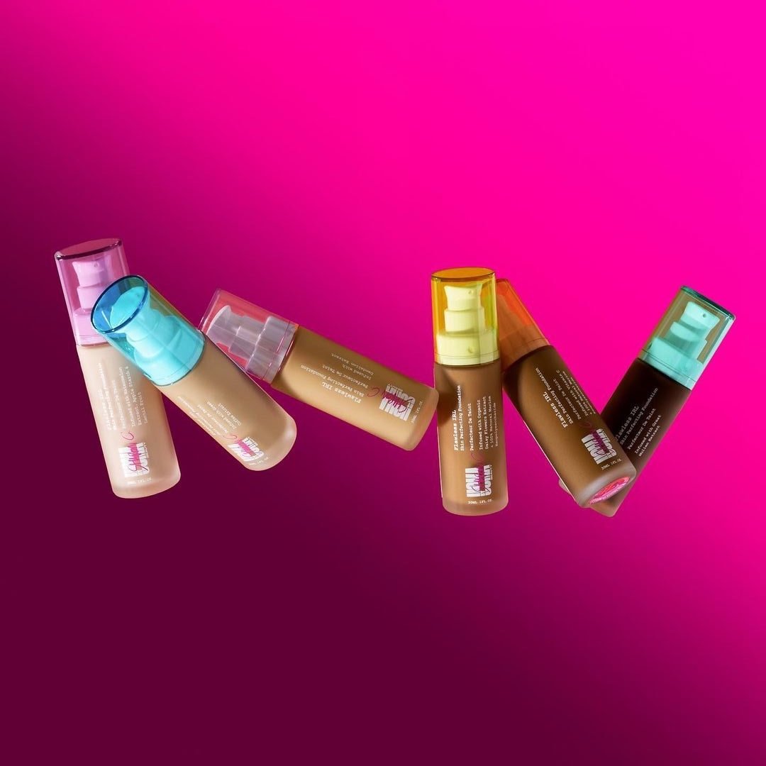
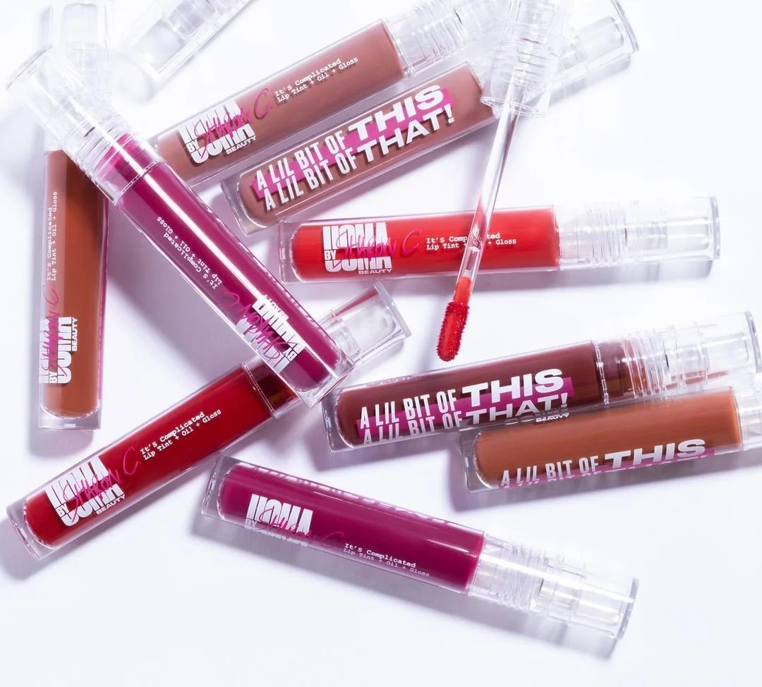
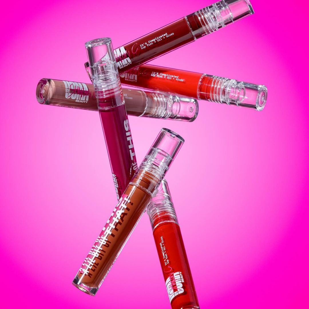
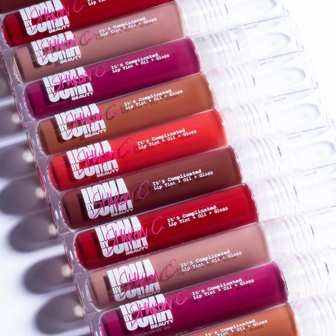
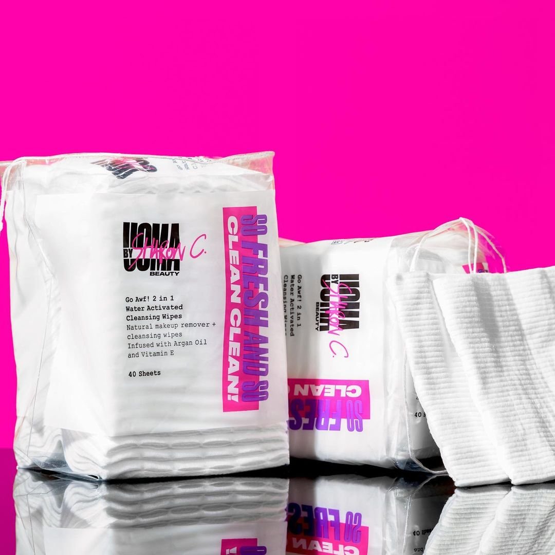
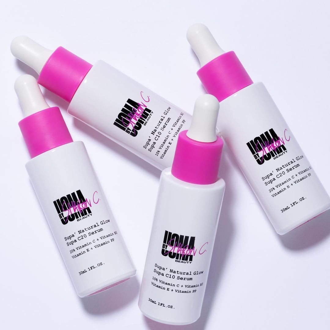
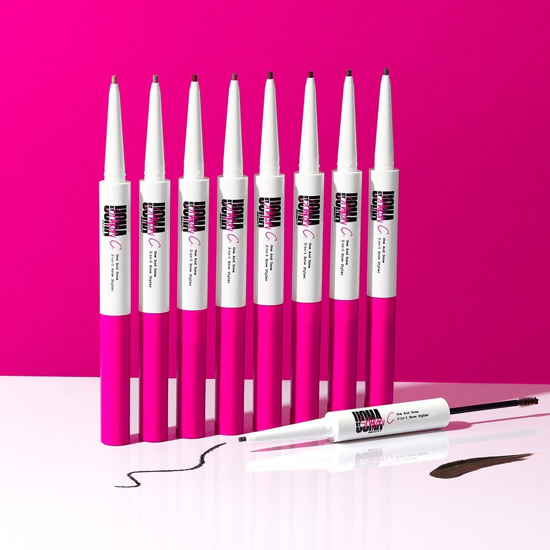
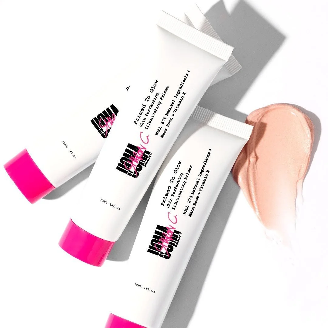
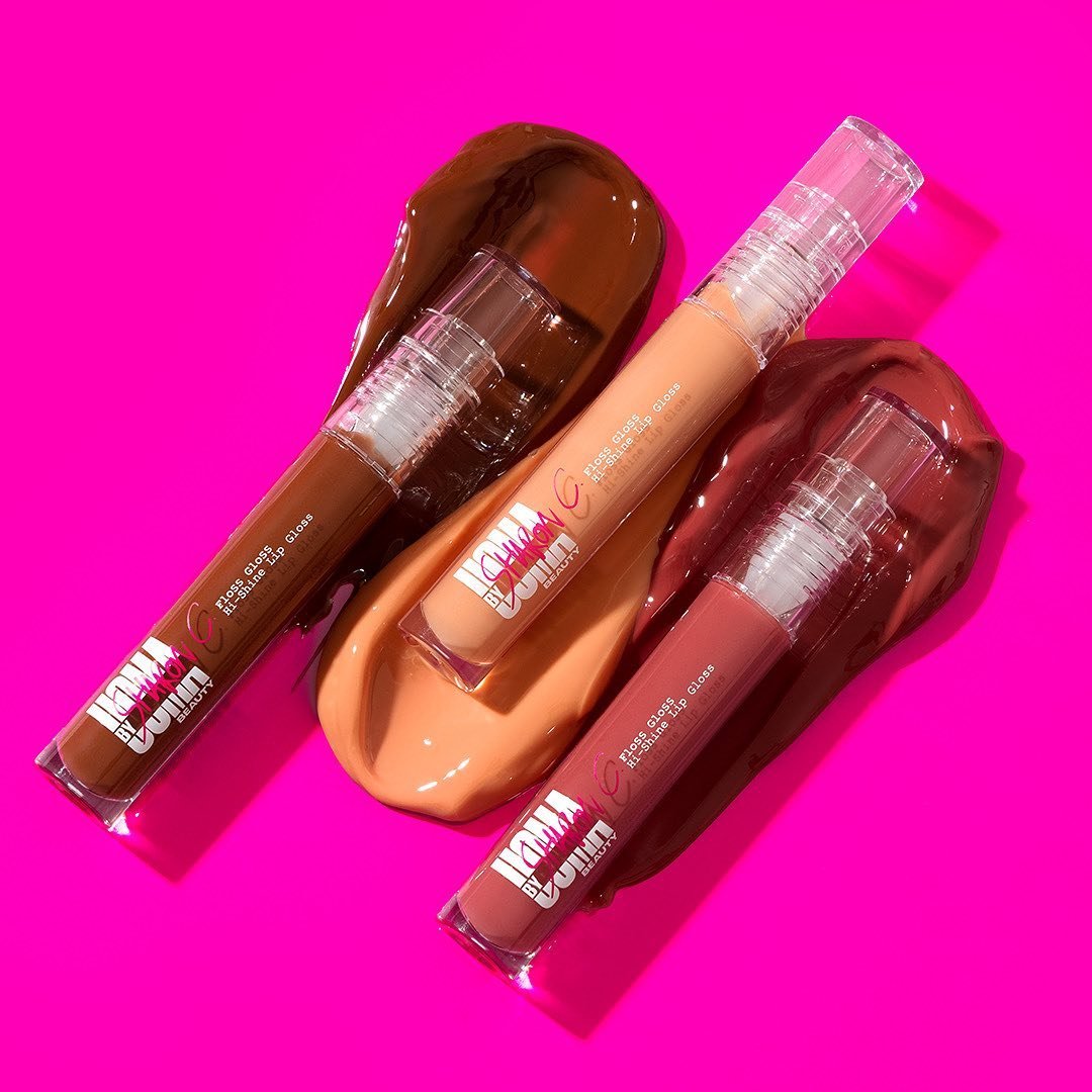
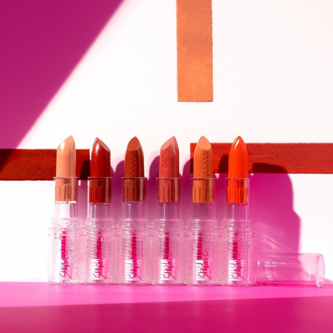
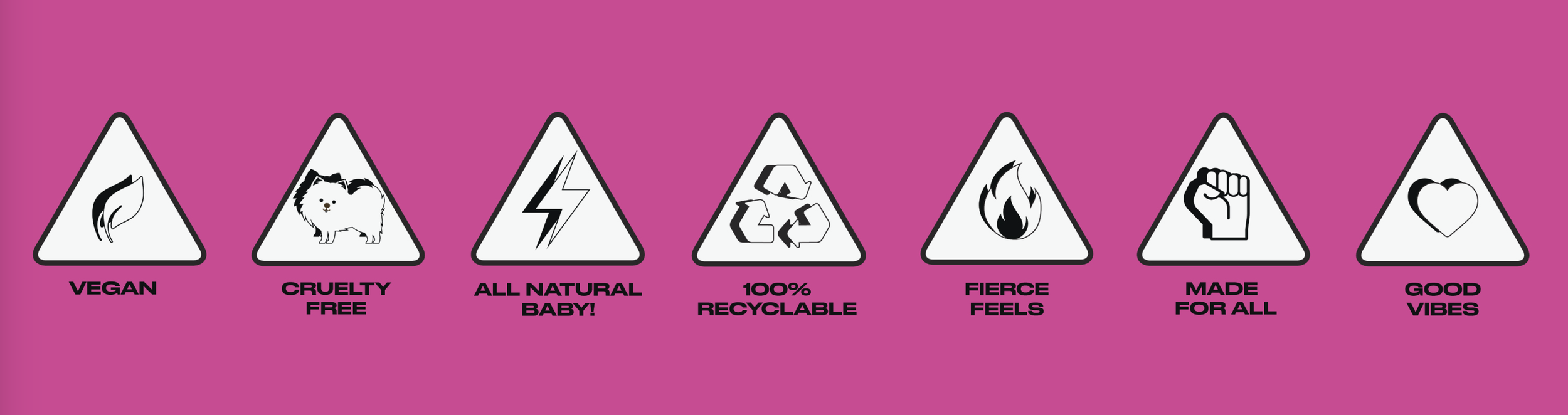
Created as UOMA Beauty’s rebellious little sister, UOMA by Sharon C was born. Designed to be inclusive for everybody and price accessible while delivering great world-conscious products; we took the fundamentals from UOMA main line and deconstructed them to form a new style. Combining typefaces of DRUK with an analog inspired typewritten font, UOMA by Sharon C is all about contrasts. Clean doesn’t need to be expensive.
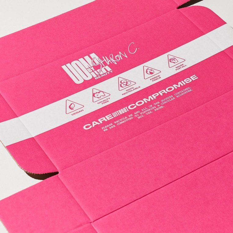
The logo used a handwritten marker (my own hand) to add personality and character to the otherwise standard brand mark.
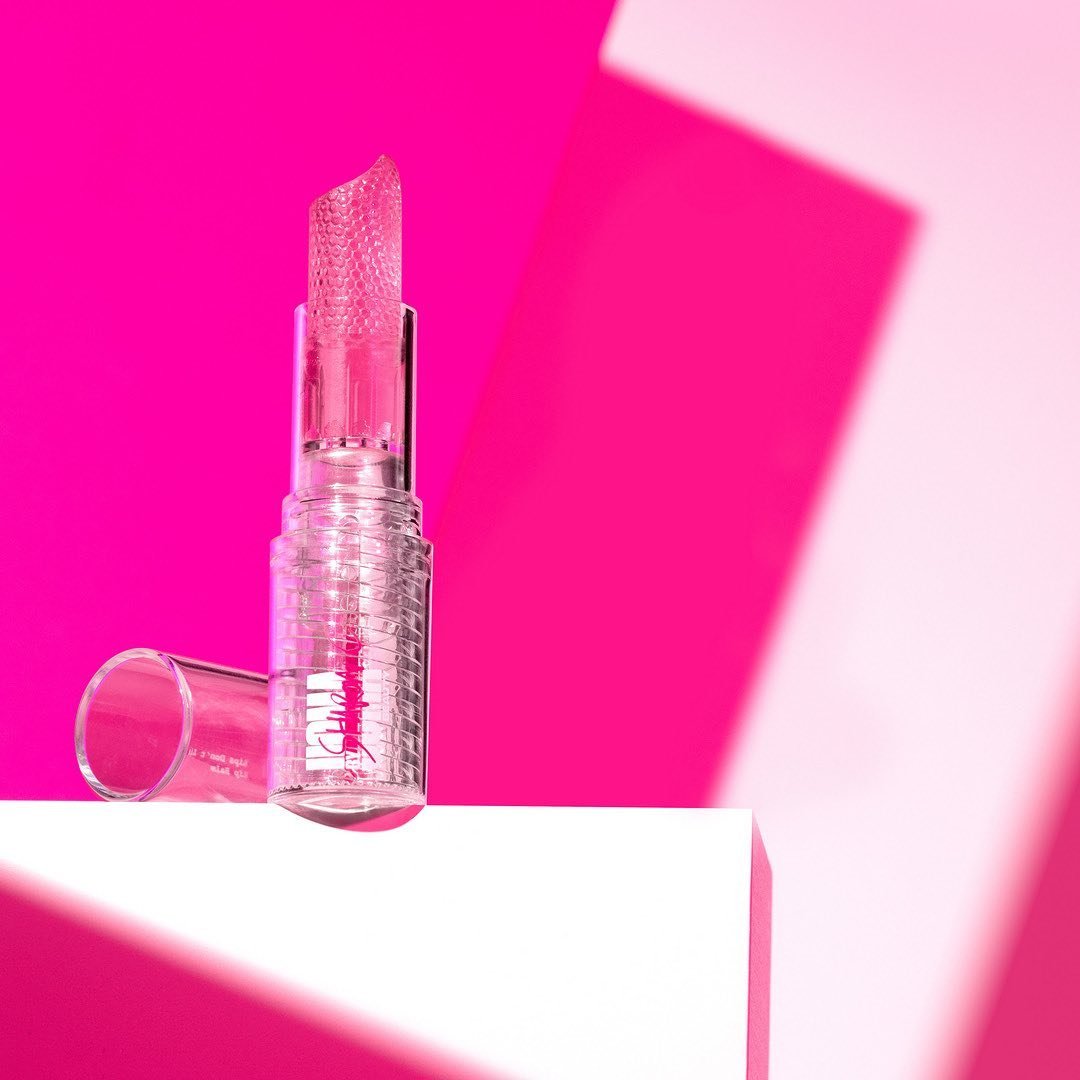
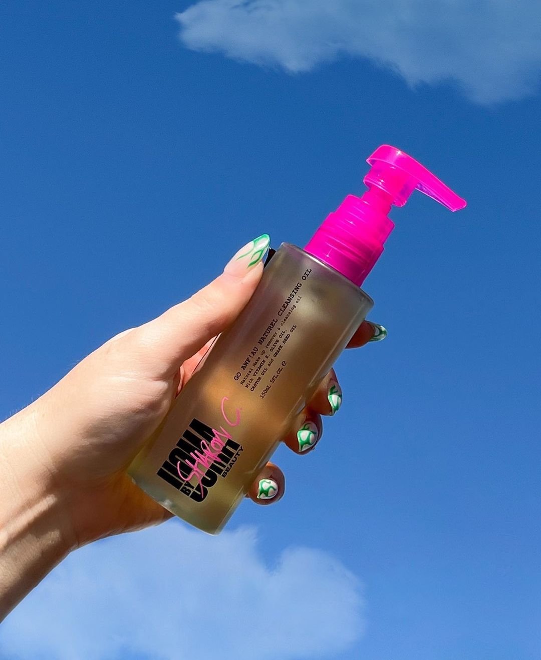
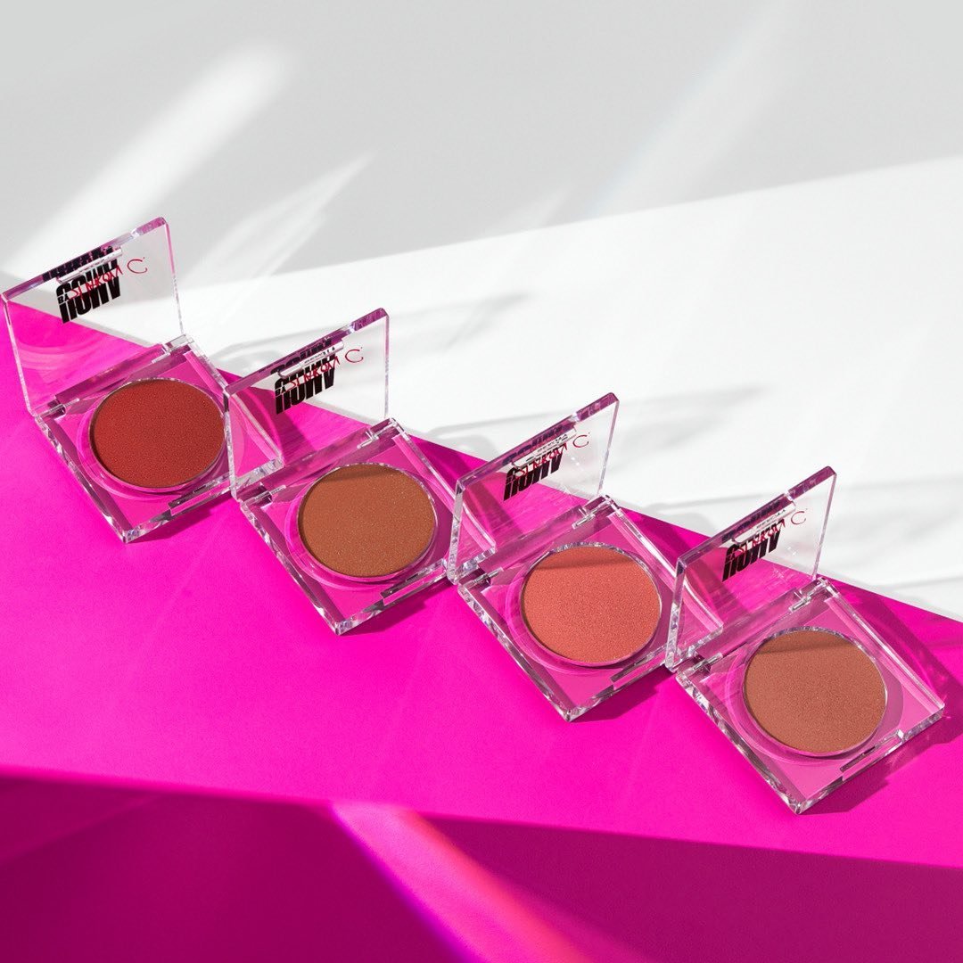
Hot pink is now synonymous with the brand and was one of the first to use it as its base colour.
Brand Identity
Brand Strategy
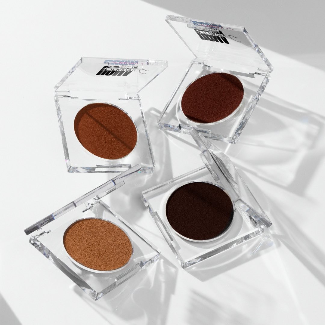
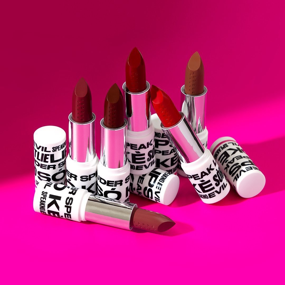
Packaging Design
Brand Guidelines
@Spring Studios
Art Director + Designer