International style authority, Olivia Palermo launched her eponymous brand in 2020 and needed a memorable visual identity.
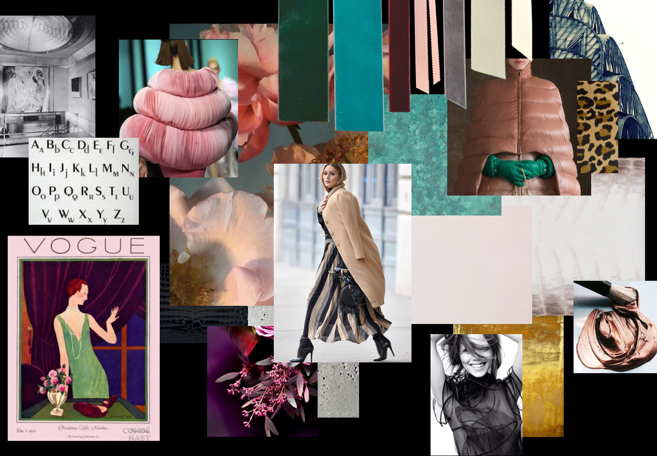
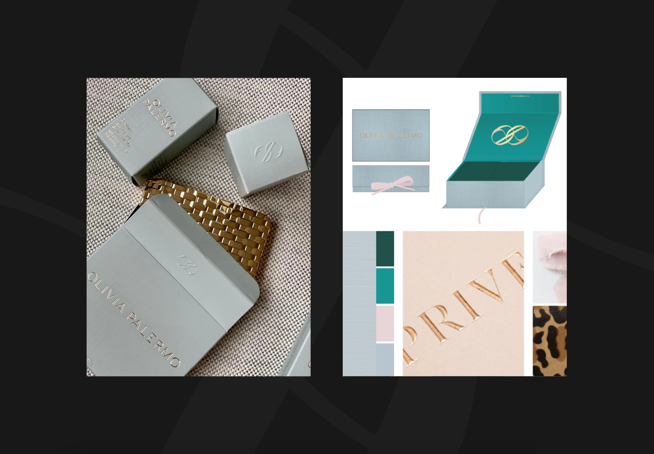
We brought the brand to life through a considered design aesthetic, creating a physical brand board as you would a fashion or interiors collection. The colour palette was defined by fabric and ribbon swatches, whilst jewellery, metals and paper swatches informed product packaging and corporate collateral.
Olivia holds an admiration of symmetry and repetition of elements. Art Deco New York became a key inspiration - stemming from a love of her hometown and inspired by the glamour, exuberance and power of the era. The brand was built with the same sensibility: clean lines, fresh colours and considered creative execution.
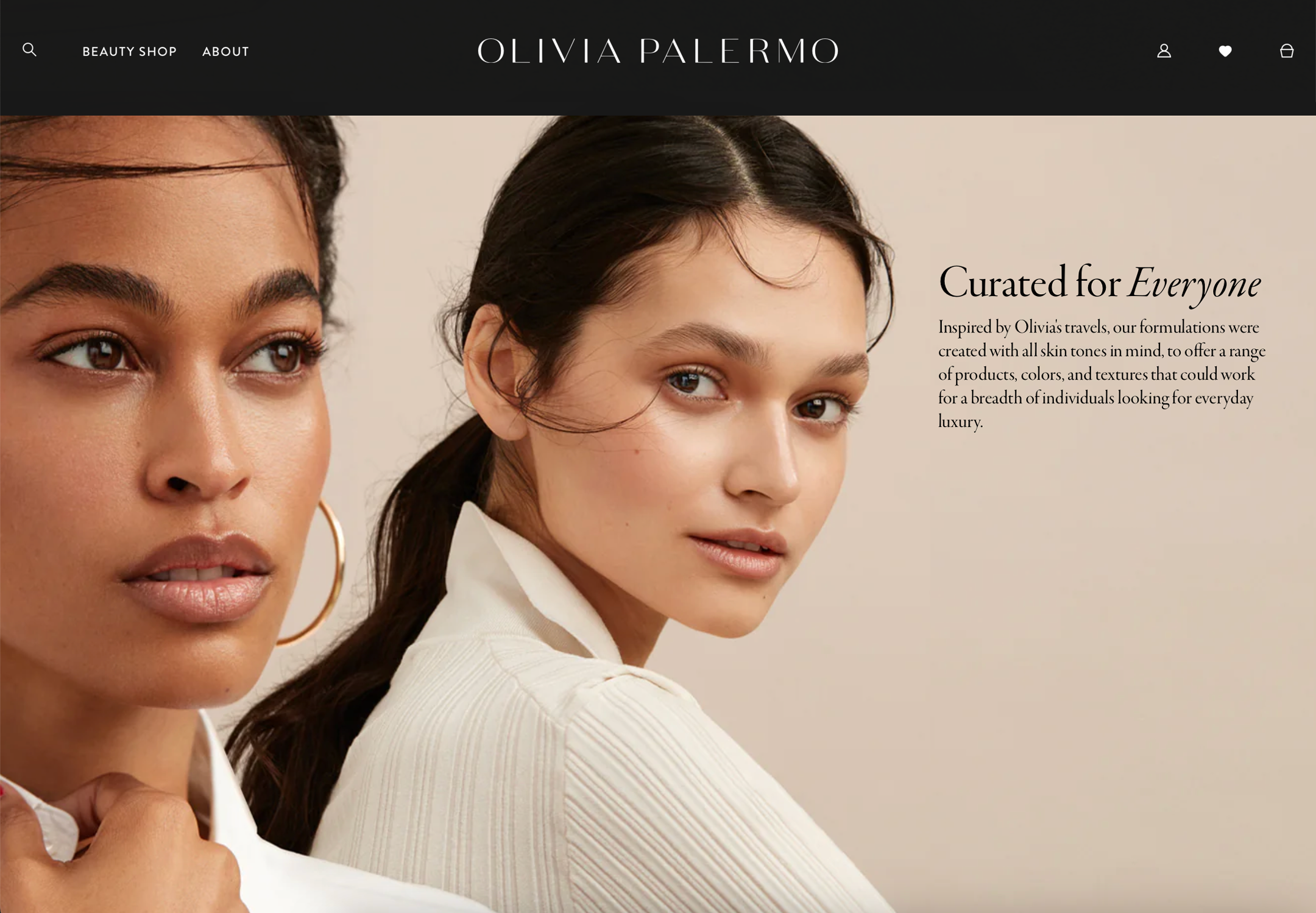


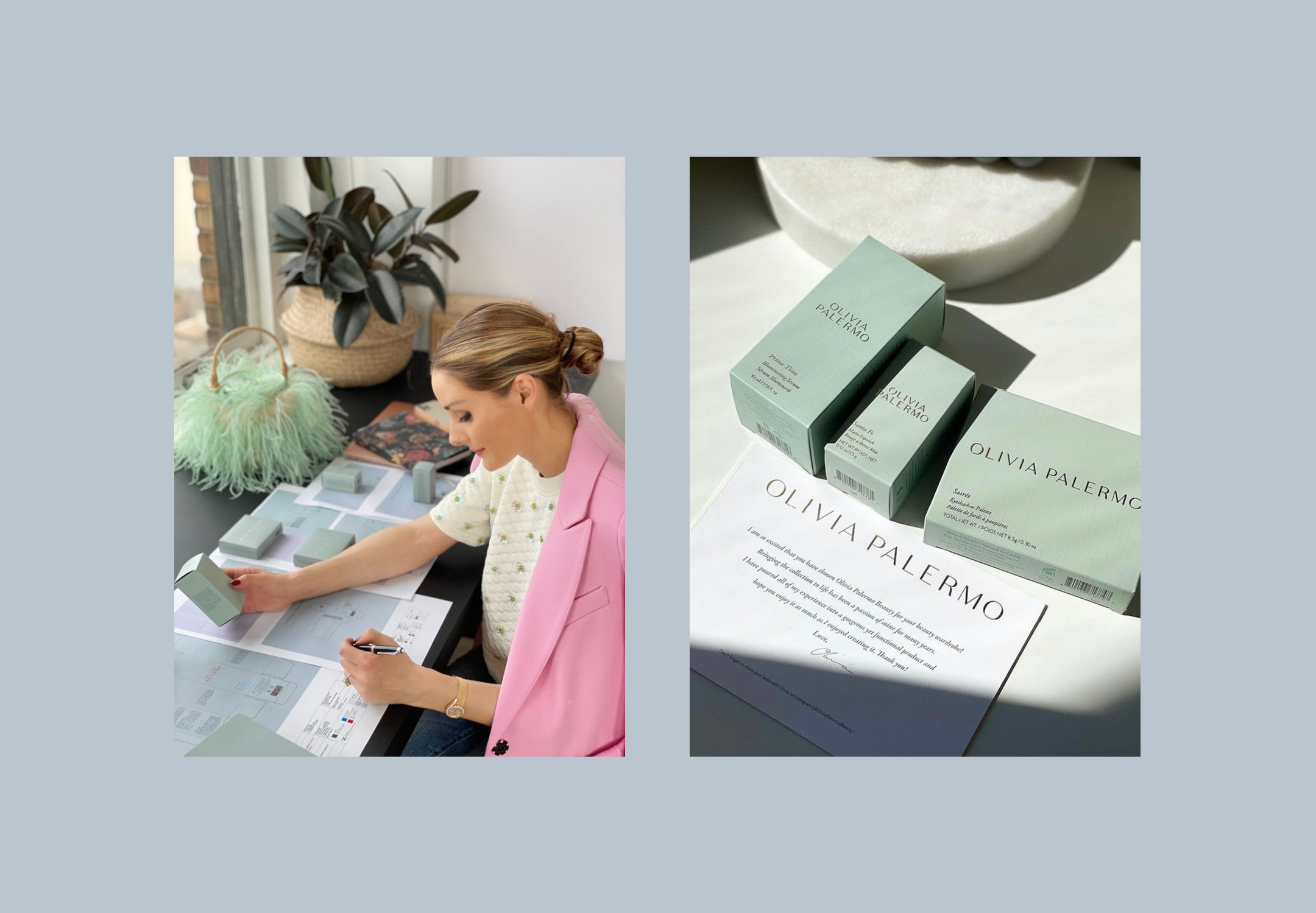


Olivia has since launched her beauty brand ‘Olivia Palermo Beauty’ translating the branding into a beautiful line of lipsticks, eye shadows and skincare. I will never tire of seeing a brand truly come to life.
Images courtesy of Olivia Palermo Beauty
Visual Identity
Printed Collateral
Brand Guidelines
Art Direction
@Spring Studios
Art Direction + Design