

Brand naming, identity design and interiors for industry game-changer facial aesthetics company, Ouronyx. Ouronyx is redefining the medical beauty space as the first global destination focused exclusively on non-surgical facial treatments, where medical experts, luxurious surroundings and bespoke approach create an elevated client experience, a fresh approach to the category.
Inspiration was drawn, not from a clinical or sterile environment but settings akin to five-star hotels and private member’s clubs.

Ouronyx: a unique name with a unique meaning. The dazzling gold of ‘ouro’ represents our public self. The dramatic black of the ‘onyx’ symbolises our private self. We believe it's only in understanding and accepting this duality of self that true synergy is achieved.
We all have a public and private face, Ouronyx celebrates this duality and enables you to put your best face forward.

At Ouronyx we believe beauty has power. The power to inspire confidence and positive outcomes. We help people harness the power of their own beauty; empowering clients to believe in what makes them unique.
We used Hatton from pangram pangram foundry, a font which celebrates craft and the imperfection and hand rendered nature of signage in Hatton Garden.

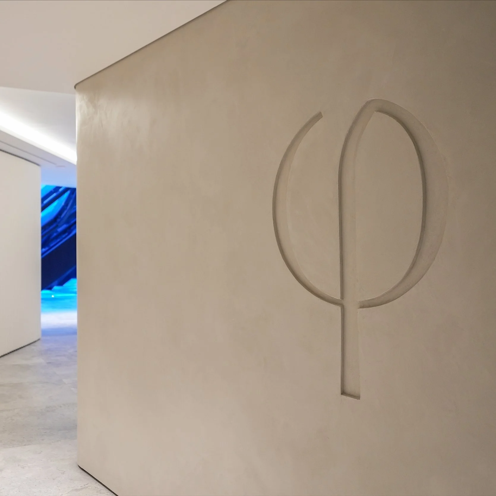
The ancient symbol of ‘phi’ or the ‘Golden Ratio’ - a mathematical ratio found in nature, art, architecture, music and the human form. The perfect symmetrical relationship between two proportions; and the perfect symbol of the Ouronyx ethos.

You are unique, a true one-off. Let’s celebrate that with a visionary approach that honours who you really are. We help people harness the power of their own beauty, enhancing an individual's distinctive features, never changing them.


We celebrate a harmony of radiance and structure at Ouronyx
Sharp lines and organic textural accents punctuate a destination that not only provides technology and data-led experience, Ouronyx aims to change the narrative in the industry’s approach to beauty.
Interior Inspiration
At Ouronyx we value timeless style and beautiful design that instil a peaceful environment in the space. The St James' space is a triumph in design and delivery; the sleek, geometric interior with it's calm, earthly tones is designed to support the concept of equilibrium between nature and science. Compliment the organic and harmonious approach to facial aesthetics. At the core lies the values of balance, precision and symmetry, echoed in the impressive building. Sublime interiors are built to elevate an aesthetics clinic into a place where beauty can be truly savoured.
structure

volume

texture
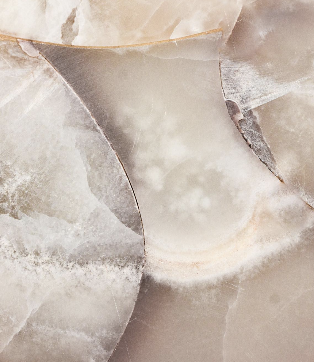
personality


Visual Identity
Interior Consultant
Brand Guidelines
Art Direction
@Spring Studios
Art Direction + Design